Malts.com
Redesign of Malts.com to encourage recruitment, discovery, and brand love.
The brief
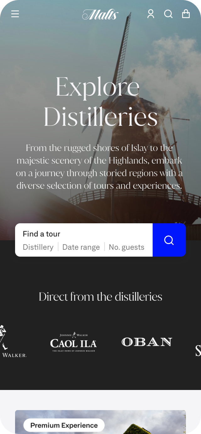
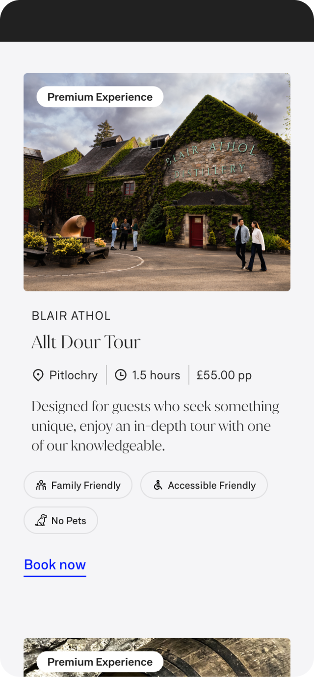
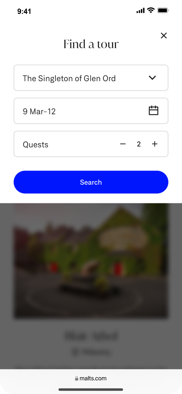
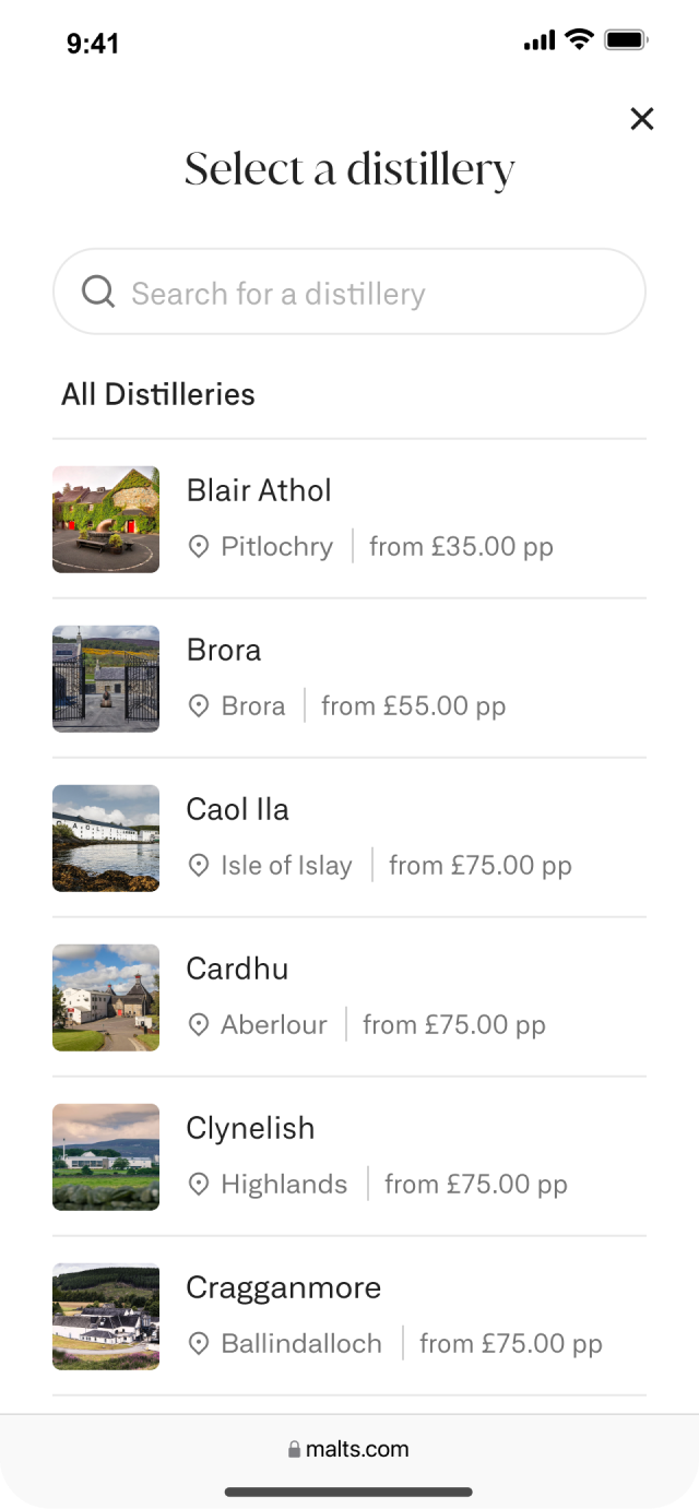
Malts.com, a hub for luxury single malts, sought to redesign its website to reflect the premium nature of its products better. The goal was to create an engaging, immersive digital experience that would foster discovery, encourage recruitment of new whisky enthusiasts, and deepen brand love among existing customers.
-
Redesign the Malts user experience from start to finish. Setting a new strategy, creating a new design system and creating new user journeys.
-
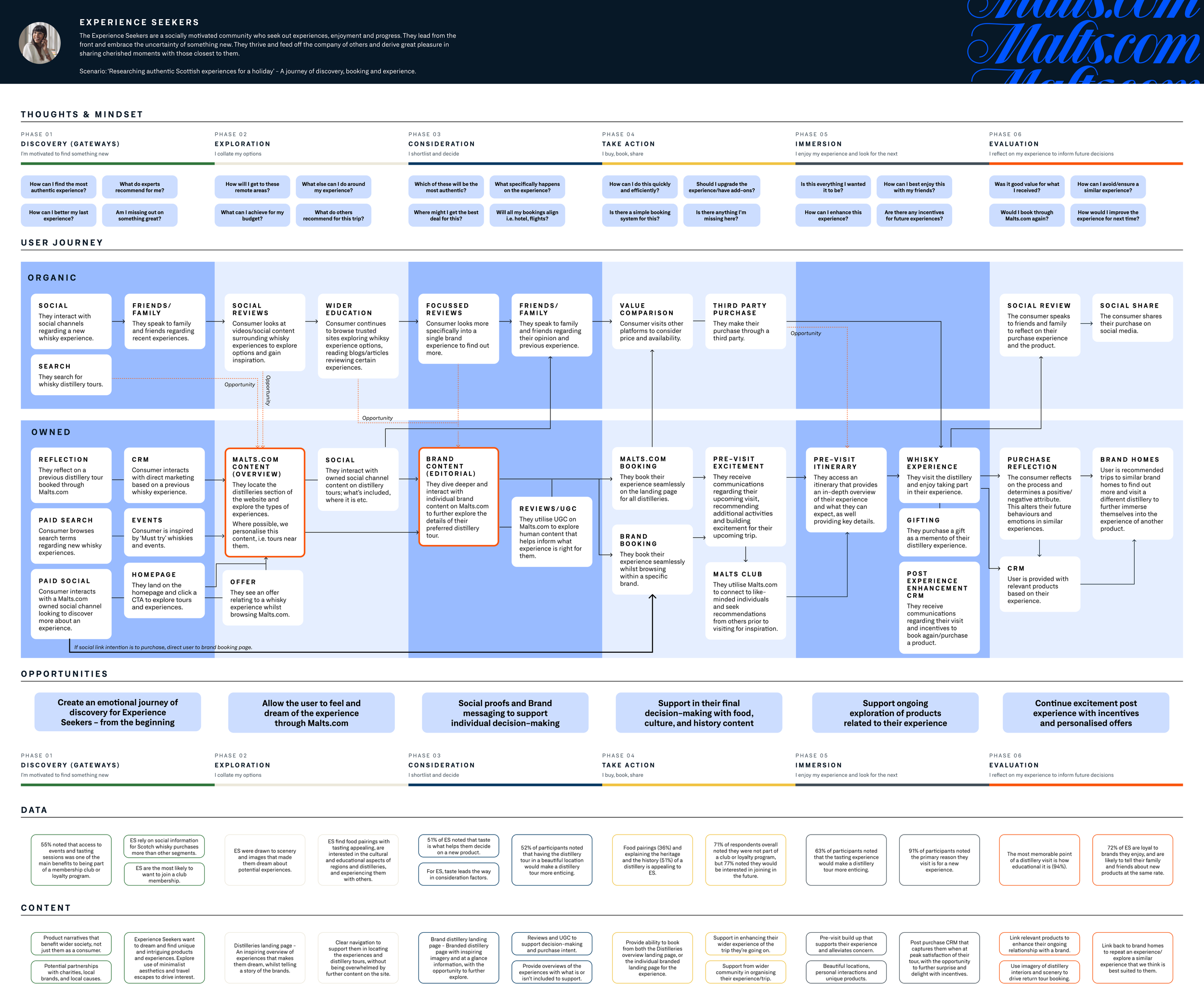
By taking a journey-based approach based on personas we were able to dissect the current experience and set the vision for the future experience.
We then moved in sprints to design and execute each section of the site.
Impact
🏆 Proudly shortlisted for the Drum Awards for Marketing EMEA.
🚀 Achieved a remarkable 78% uplift in conversion rates by streamlining and optimising user journeys.
🔍 Drove a 196% surge in organic search visibility, significantly expanding the brand’s online reach.
📈 Boosted user engagement by 25%, reflecting a more compelling and interactive site experience.
💎 Elevated luxury sales, with nearly 50% of total purchases now coming from premium product lines.
Phase 1 - Empathise
Before we could create a new experience for Malts.com, we first needed to understand the problems with the current one. This meant identifying pain points, aligning with stakeholders, and setting a clear ambition for what the site should become. Without this shared vision, the work that followed would risk losing focus or impact.
Approach
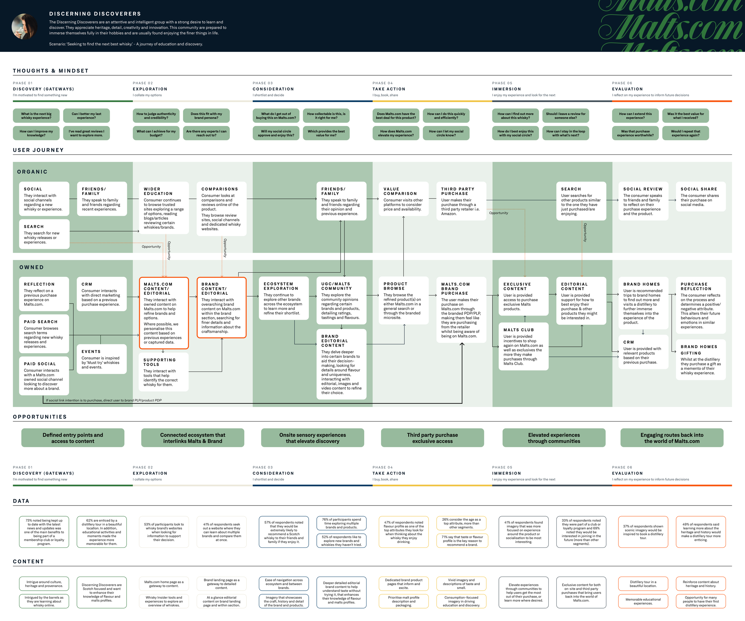
We began by defining key user journeys and mapping them against established personas to see how well the site currently supported different customer needs. Alongside this, we carried out a deep dive of research with both stakeholders and customers, building a rounded picture of frustrations, opportunities, and aspirations.
Outcomes
A new direction for Malts.com, agreed with stakeholders and grounded in customer needs.
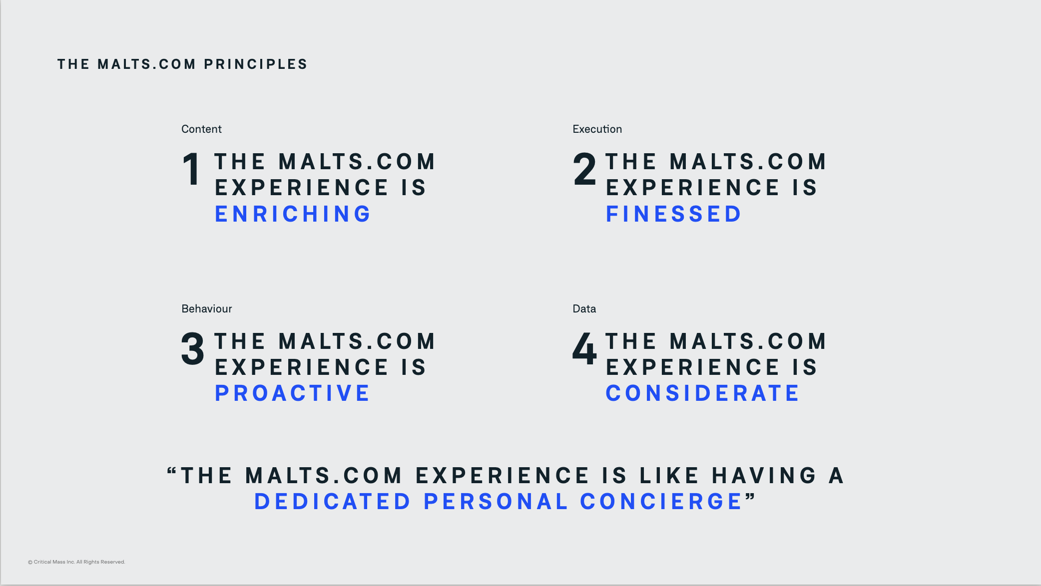
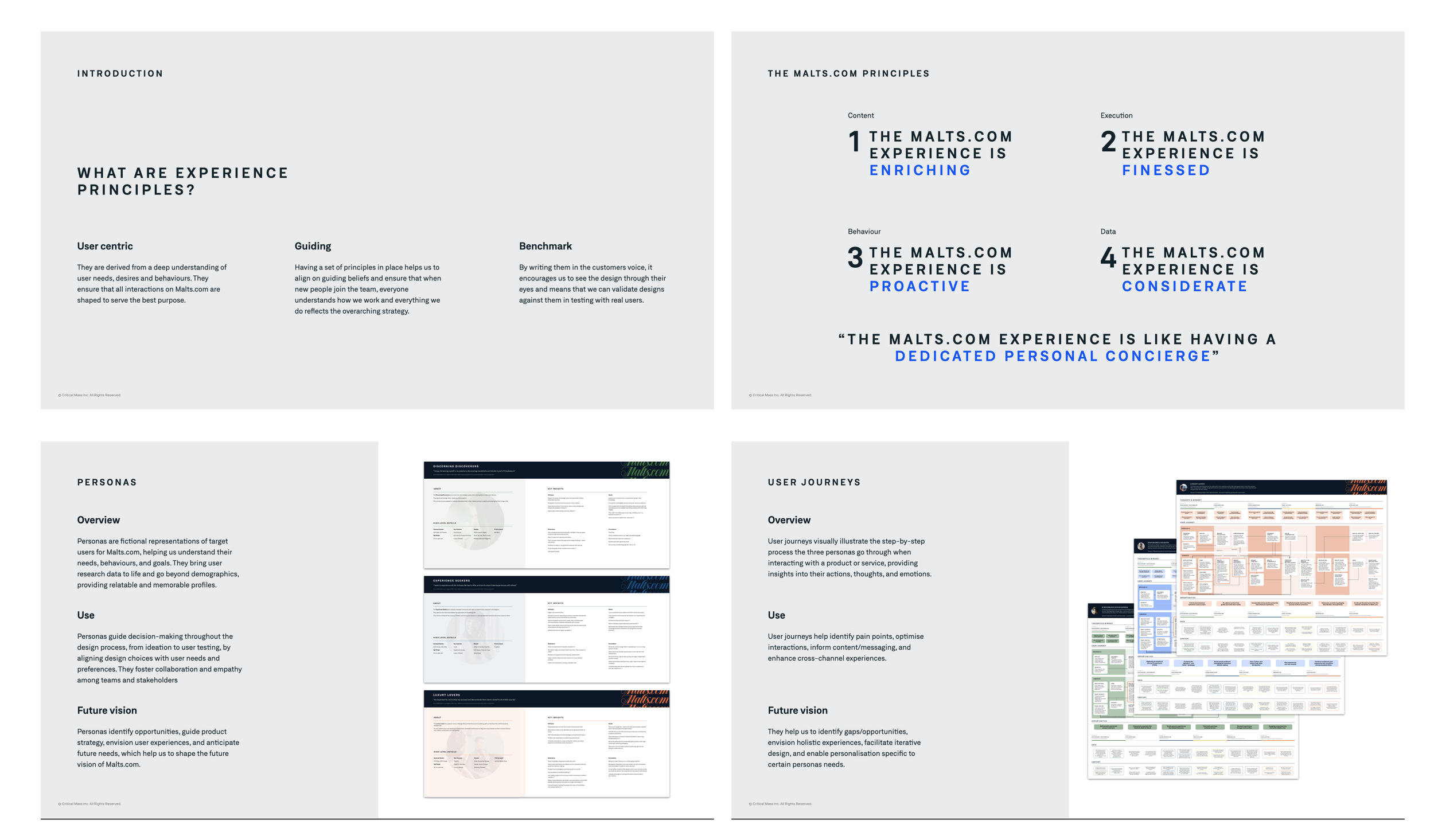
A set of experience principles to guide decision-making throughout the project.
Defined page briefs and user flows that outlined how the site would function.
An overarching creative vision to inspire and align the design team.
This phase set the foundation for the redesign, ensuring every decision was purposeful and tied back to a shared understanding of the customer experience.
Phase 2 - Empathise Validation
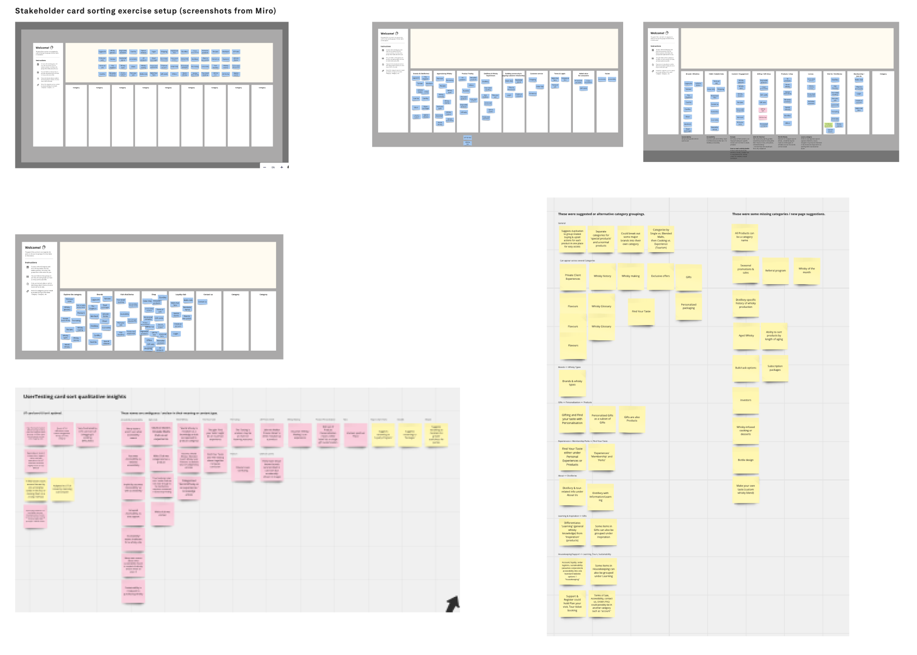
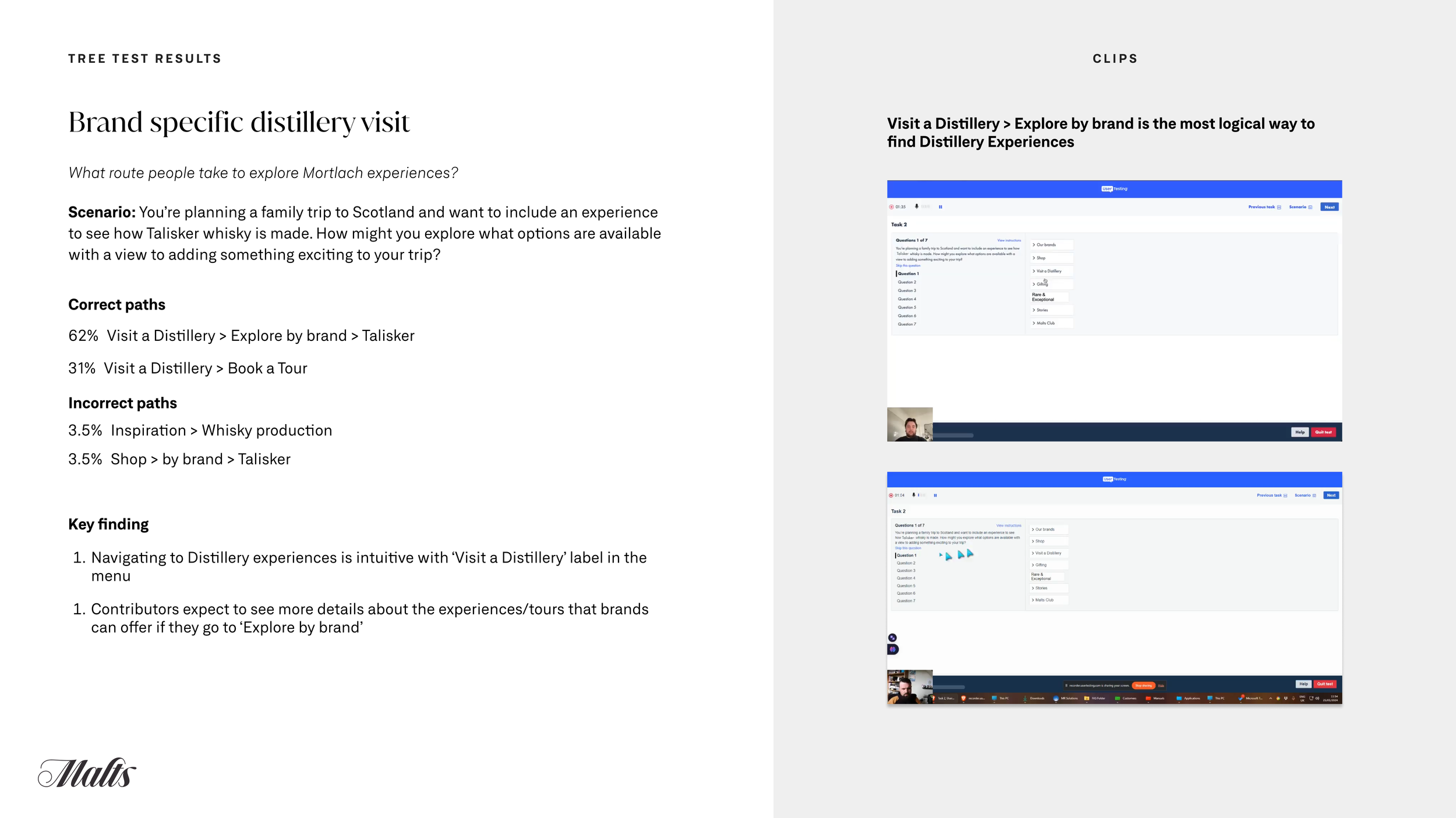
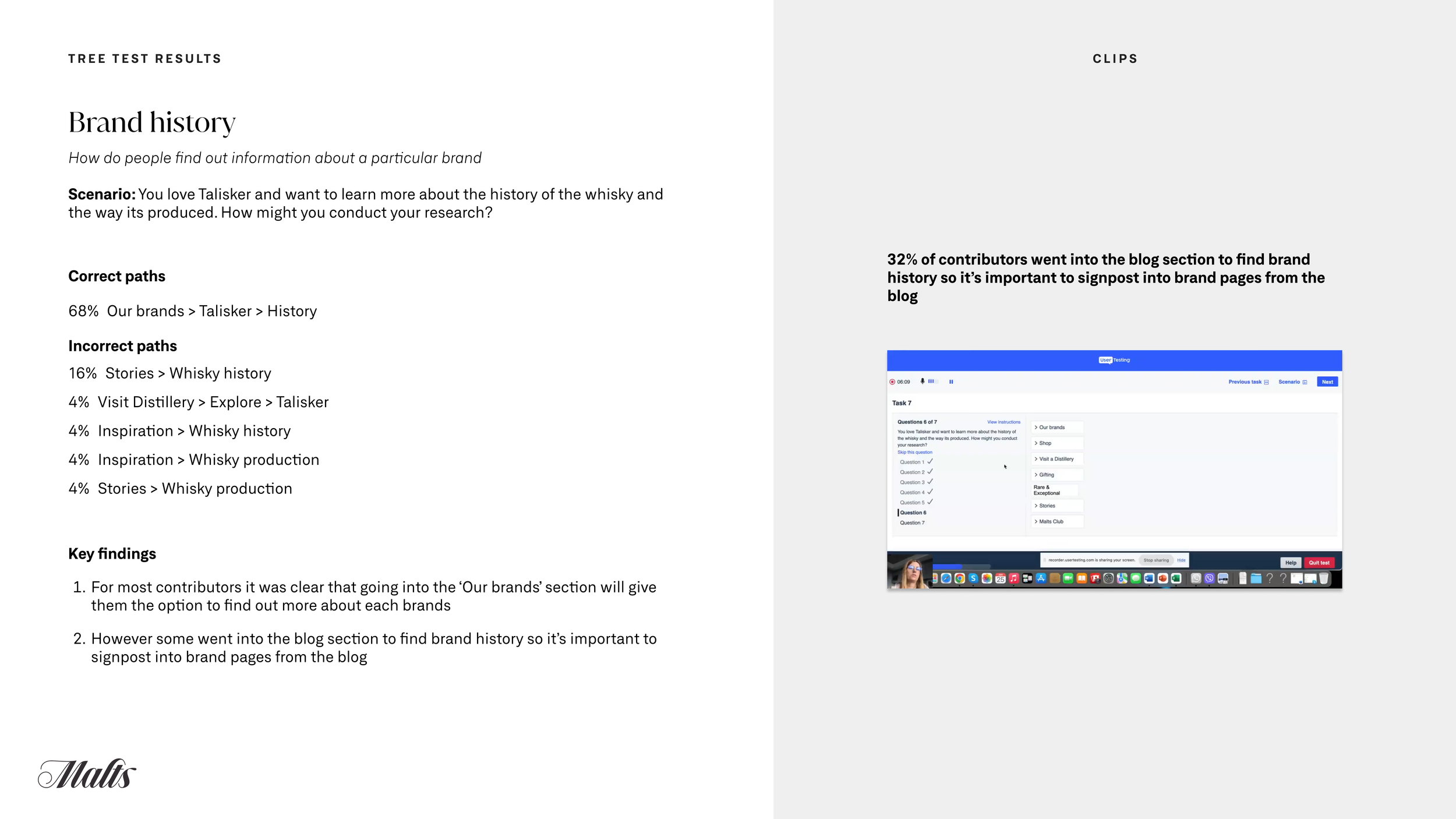
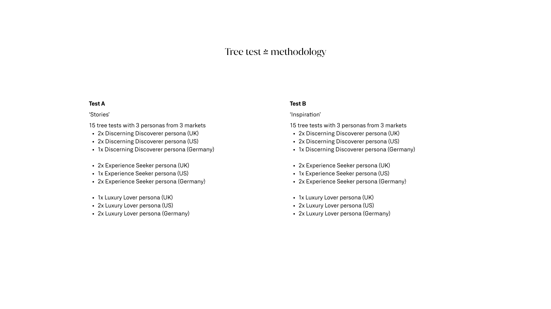
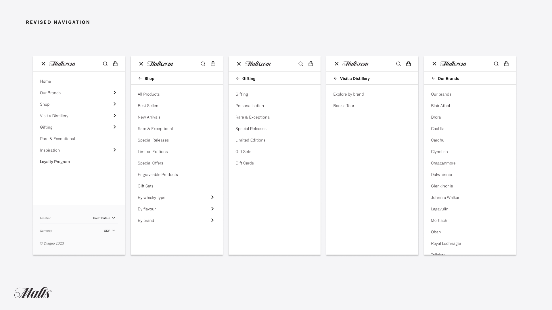
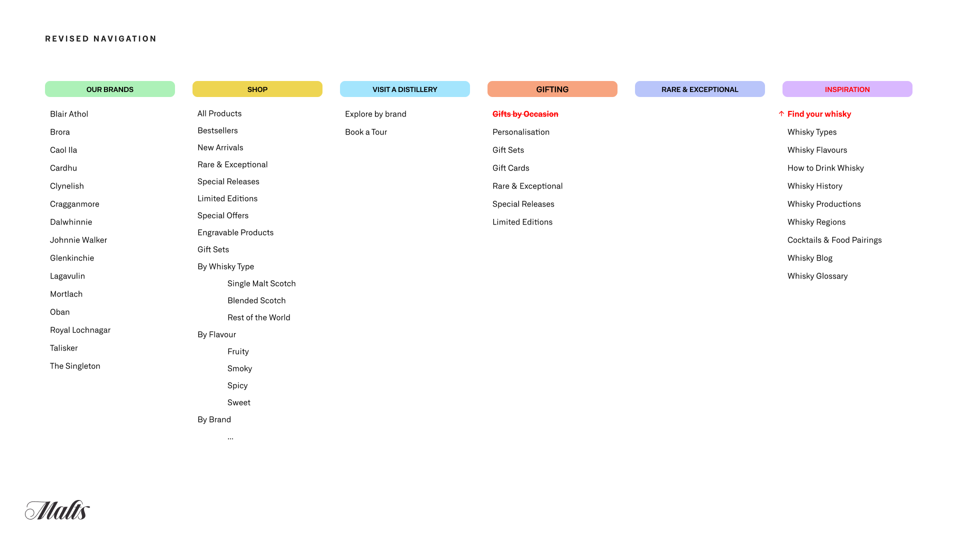
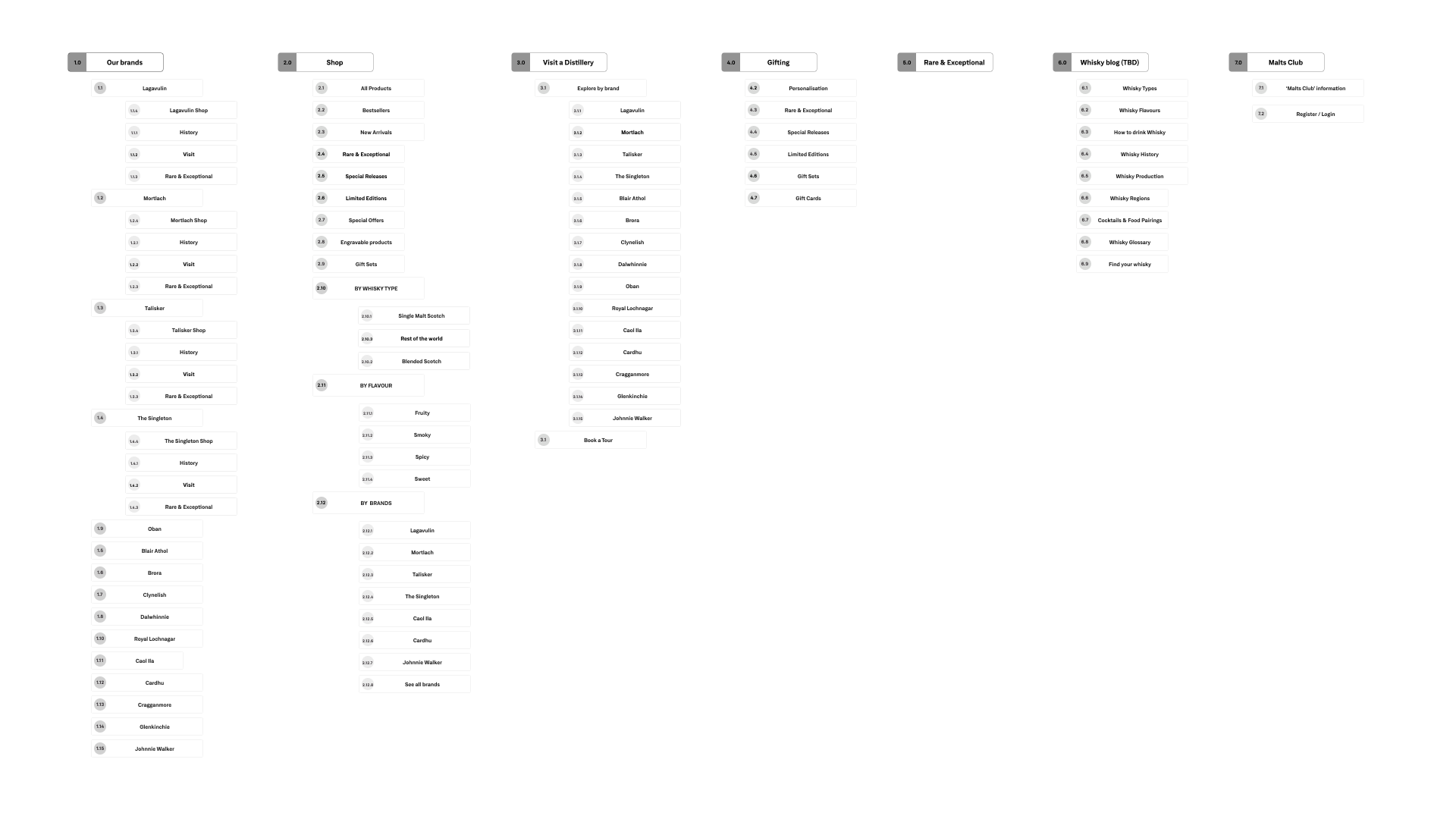
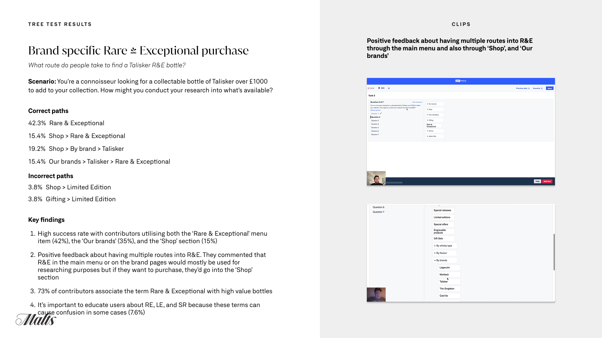
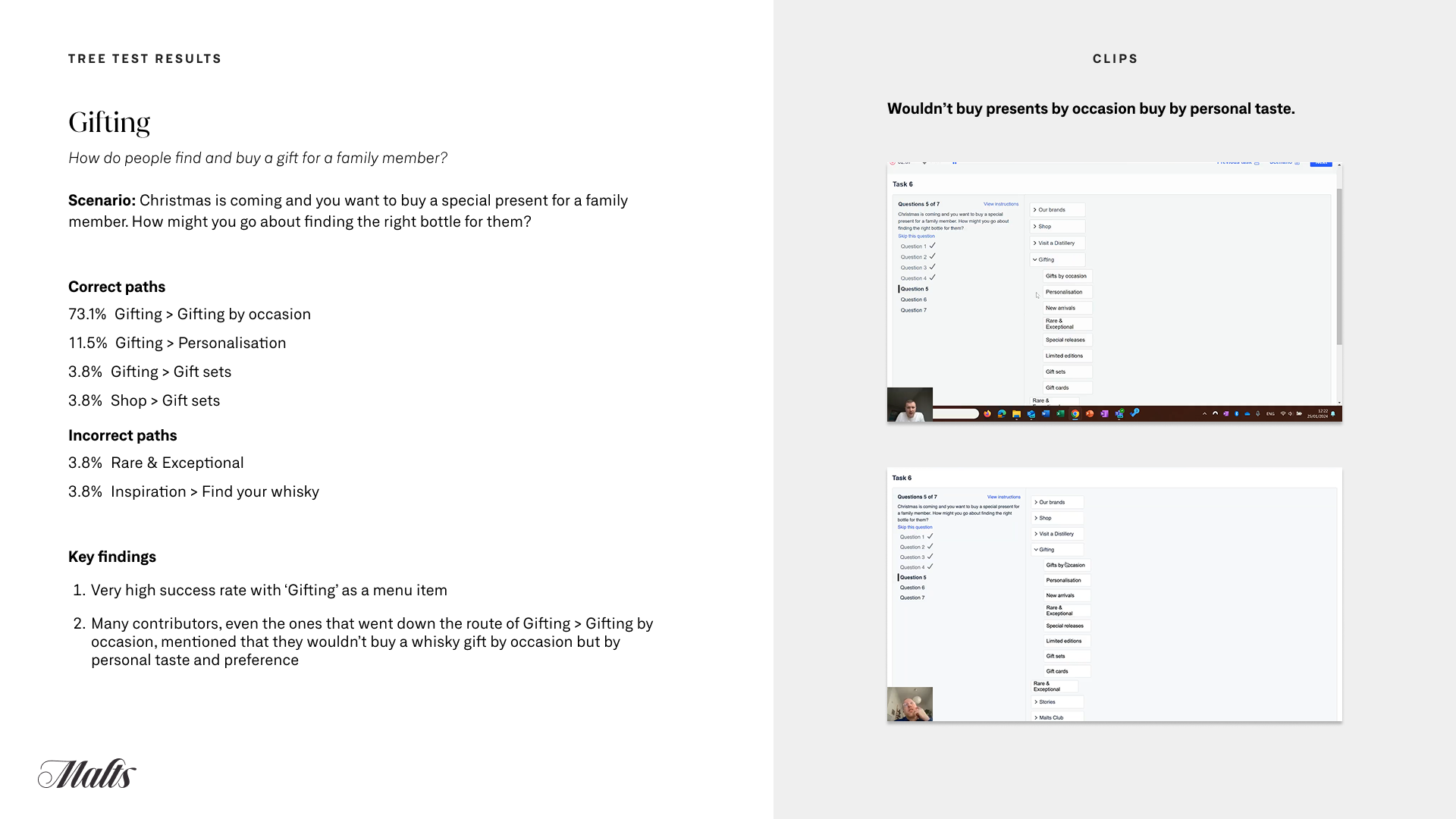
Before committing to build, we tested and validated our proposed journeys and structures with real users. Using tree testing, card sorting and quick concept validations, we ensured the information architecture and design routes reflected customer behaviour and gave stakeholders confidence in the direction.
Approach
User insight at the core – Before committing to a full build, we tested and validated key journeys and structures with target customers.
Tree testing – Checked whether users could successfully navigate the proposed IA and find products or content quickly.
Card sorting – Explored how users naturally group and label content to inform taxonomy and menu structures.
Design route validation – Ran quick-turn concept tests with customers and internal stakeholders to compare alternative design directions.
Iterative learning – Fed insights back into wireframes and prototypes before visual design, reducing downstream rework.
Challenges
Recruiting representative testers – Ensuring test participants mirrored Malts.com’s premium whisky audience rather than a generic sample.
Balancing speed and depth – Conducting meaningful tests within tight sprint timelines.
Integrating findings across teams – Making sure insights from tree tests, card sorts and concept validations were adopted consistently across design, content and tech teams.
Managing stakeholder expectations – Some internal stakeholders were attached to legacy structures; user evidence helped drive alignment but required careful communication.
Outcomes
A validated information architecture that reflected how real customers think and search.
Early confirmation of the strongest design directions, avoiding costly pivots later.
Greater stakeholder confidence because user feedback backed up recommendations.
Clearer journeys from browse to checkout and distillery experiences, supporting both discovery and conversion.
This stage helped us de-risk decisions early, refine the information architecture, and move into design with evidence-backed confidence.”


Phase 3 - Conceptualise
With the initial research and vision in place, we moved into the conceptual design phase, applying a sprint-based approach to reimagine the site section by section.
Approach
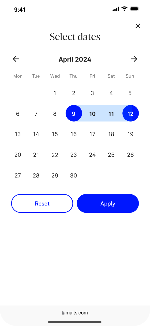
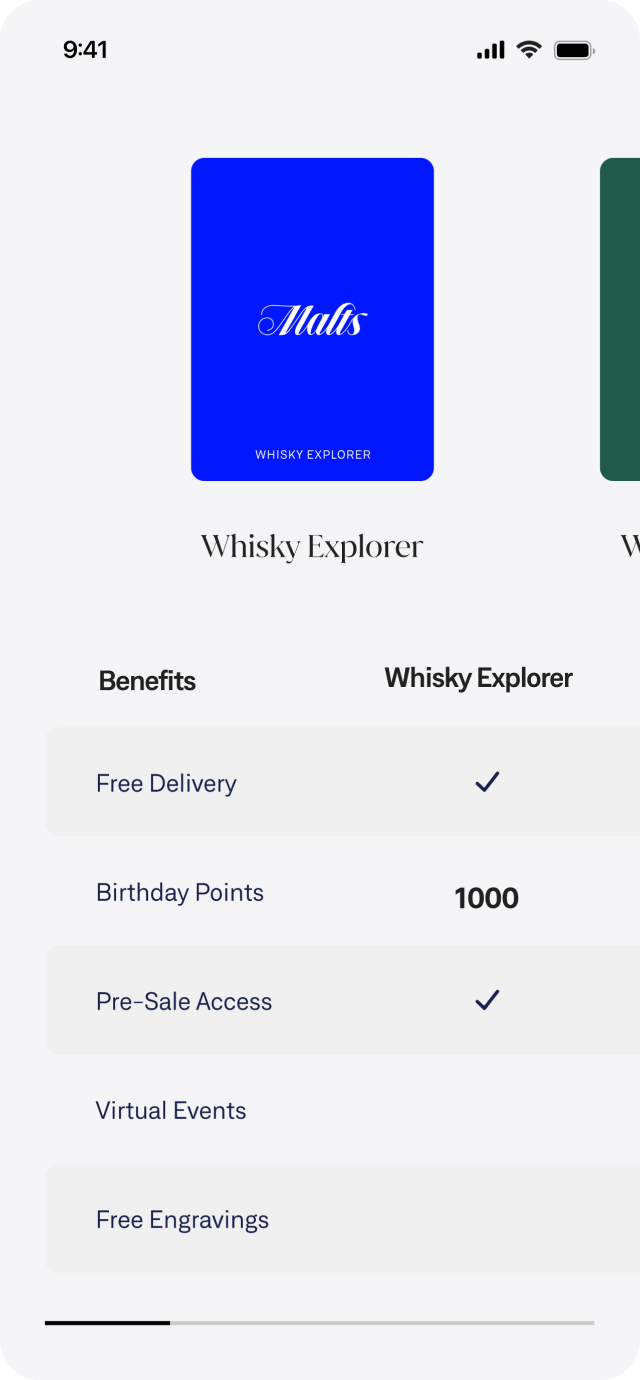
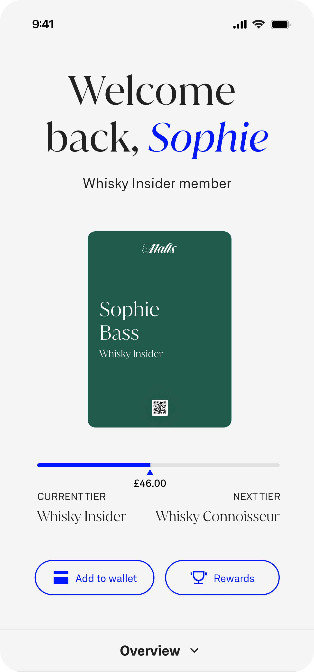
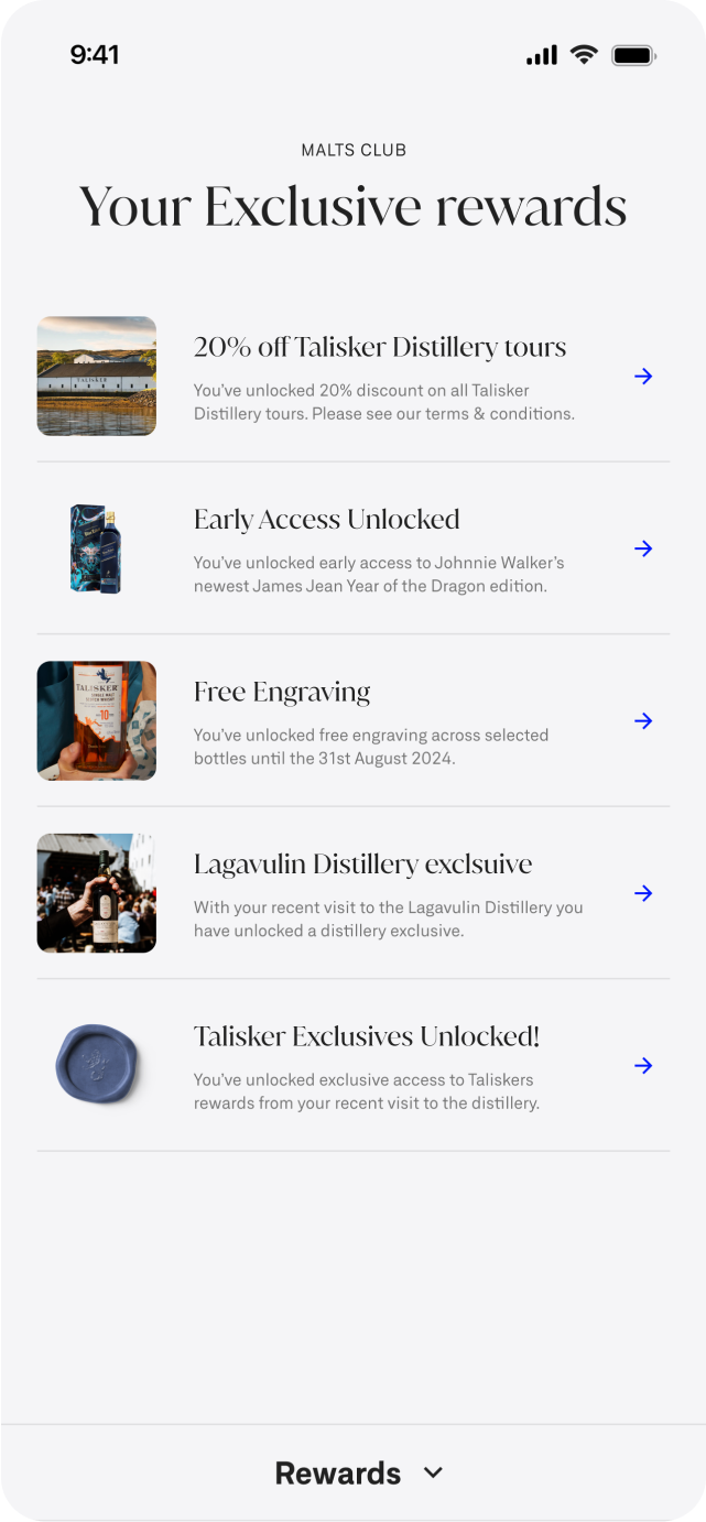
We began with the largest, most critical areas of the customer journey — the Homepage, Product Listing Page (PLP), Product Detail Page (PDP), and Checkout. Once these foundations were established, we extended the approach to additional sections such as Distillery Experiences and Loyalty.
Each sprint followed a clear, repeatable process, which you can see in the video below for a single journey:
Journey analysis – Reviewing the current experience in detail to surface friction points.
Requirement definition – Capturing both user needs and technical requirements.
Wireframing – Mapping new flows and structures for rapid iteration.
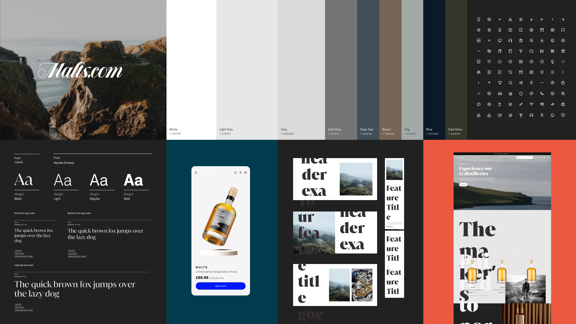
Design – Moving into creative execution once structure and flows were signed off.
Challenges
Understanding the current ecosystem - Mapping all existing website integrations (payment systems, content management, loyalty platform, analytics, etc.) to ensure redesigns didn’t break essential connections or data flows.
Cross-department alignment - Bringing together brand, e-commerce, marketing, and IT stakeholders—often with different priorities and KPIs—to agree on one unified vision for key journeys.
Maintaining performance while improving UX - Redesigning pages and flows to be richer and more compelling without slowing page load times or disrupting SEO.
Creating a consistent journey across sections - Standardising navigation, page layouts, and interaction patterns so that Homepage, PLP, PDP, Checkout, and Distillery Experiences all felt cohesive.
Balancing conversion and brand storytelling - Enhancing the funnel for recruitment and purchase while still delivering premium, discovery-led storytelling around the single malts.
Working in fast sprints - Keeping design quality high while meeting tight sprint cycles, including rapid stakeholder feedback loops and sign-offs.
Outcomes
A journey-based framework that ensured consistency across all site sections.
Rapid iteration and faster sign-offs by aligning structure early through wireframes.
A clear pathway from concept to design, reducing rework and keeping momentum across sprints.
By combining structured sprint cycles with a journey-focused lens, we were able to maintain pace, ensure alignment, and steadily transform Malts.com into a more seamless and engaging digital experience.


Phase 3 - Realise
The final phase of the project focused on ensuring the designs were not only creative and user-centred, but also technically feasible and validated with customers before launch.
Approach
Technical alignment – We worked closely with both internal and external technical teams, reviewing detailed specifications and prototypes to ensure feasibility. Particular attention was given to animation, transitions, and intent, aligning on how interactions should feel in practice.
Customer validation – User testing was embedded throughout the design process. Each iteration was tested against customers’ expectations and mental models to confirm the experience was intuitive, consistent, and engaging. Testing was run both internally and directly with customers, enabling rapid feedback loops.
Outcome
Designs that were technically sound and implementation-ready.
An experience validated with real customers, giving confidence that the site met their needs and behaviours.
The full redesign is now live on Malts.com, delivering a more seamless, premium, and user-friendly journey across all touchpoints..